A Same Website for Desktop and Mobile
Internet is turning mobile. So what should I do then? Make a desktop version and a mobile version of my website? Not really. CSS at the rescue.
Fluid Grids
The first thing to do is to use fluid grids, which means using only relative sizes in your CSS, instead of absolute ones. You can setup sizes relative to the default browser font size, to the parent HTML blocks, etc.
With this kind of relative sizing, when the user changes the size of the browser, all the elements keep the same proportions.
Media Queries
But what if a screen size gets to this critical point where keeping the same aspect and proportion is not relevant anymore? Then, you should use media queries.
Here again, this is a CSS technique that you can use to reorganize the layout of your webpage upon certain conditions. For instance, if the width of the browser is below a certain size, you can give up a column layout and switch to a single-column layout where blocks are placed one upon another.
Fluid Images
Of course, this is not enough and new issues are going to rise when you’re going to put images, or YouTube embeds inside your pages.
Some stuff can help (the CSS max-width attribute for instance), but it’s
not universally supported yet.
What about iOS?
What’s interesting me most here is not Internet Explorer-compatibility though, but making websites that look good on iOS devices, the iPhone and the iPad. I’ve tried to give these techniques a try and here it is:

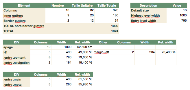
This is a 10-column layout of 82px each, separated by 20px gutters. With 2 outside gutters of 12px each, we get a grid defined by a default width of 1024px.
To setup my CSS correctly, some math are required:
Then I had all I needed to build the CSS for this demo page.
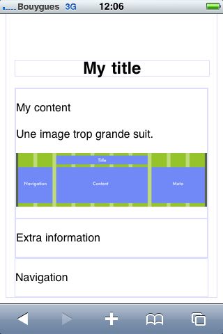
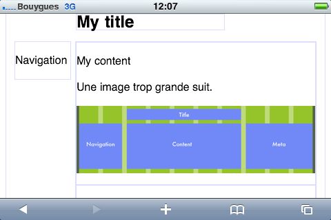
This demo page renders as follow on the iPhone, portrait and landscape: