I Care (And Code) a Lot
When I watched the trailer of Netflix’s I Care a Lot — which I recommend —, a text-effect it used striked some nostalgia from the 90s. It had this vintage Nike tee-shirt vibe to it, and I immediately challenged myself to attempt to reproduce it in CSS.
Here is what a still from the trailer looks like:
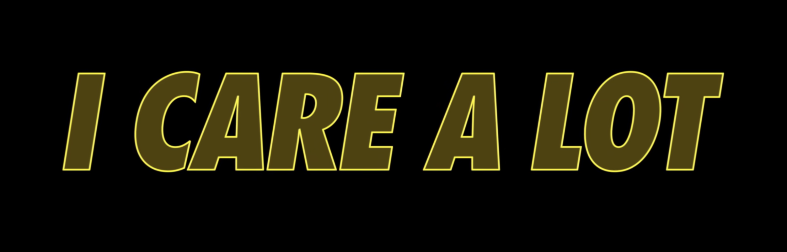
And here is the result of my CSS reproduction (works best on a desktop layout):
I Care a Lot
Play with the code on codepen.io.
About the Font
The font looks like Futura Condensed ExtraBold Italic. On macOS or iOS, since the italic version is not installed by default, it renders as a fake italic.
If your system does not include any version of Futura, the CSS effect might look nothing like the still. Sorry about that.
Animating the Colors Combination
The thing I liked was the matching between the colors of (a) the text and (b) its stroke.
At first, I was assuming it was opacity that was creating this nice combination
but it is more complicated than that. After translating RGB (Red Green Blue)
values of the color into HSL (Hue Saturation Lightness)1, things became
clearer: the color of the text was hsl(49, 64%, 18%) while the color of the
stroke was hsl(59, 96%, 68%).
This change of color model makes animating the hue of this effect very easy:
adding a complete 360 degrees rotation hue filter on our component, while
keeping the +10 difference in hue and constant saturation and lightness
values, leads to a good-looking animation.
@keyframes hue-full-rotation {
  0% {
    filter: hue-rotate(0deg);
  }
  100% {
    filter: hue-rotate(360deg);
  }
}
Here is the animated version:
I Care a Lot
-
In case you are not familiar with HSL, Paul Hebert put together this nice post, including this classic exercise comparing how easy it is to find a random color both in RGB and HSL. ↩