Pixel-Perfect Line Height With UIKit
According to Matthew Butterick, the author of the excellent Practical Typography, the number one key rule of good typography is:
The four most important typographic considerations for body text are point size, line spacing, line length, and font, because those choices determine how the body text looks.
While point sizes, line lengths and fonts are easy to control with UIKit, line spacing is a little trickier.
In this article, I will first describe in detail a clever helper to meet challenging line spacing requirements with pixel-perfect precision. Your design team will love you.
I will then explain why I actually wouldn’t recommend implementing the solution for every context, and instead provide a much sturdier pixel-pretty-close1 alternative. Your design team will still love you. I promise.
Let’s dive in.
The Designer Input
Say our design team gives us the following specs for a card view component:
- A title with a point size of 28pt and a line height of 38pt
- A body with a point size of 17pt and a line height of 24pt
- Both the title and body are 8pt apart on the Y-axis, and 8pt away from the edges of the card on the X-axis.
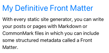
The export from Sketch looks like this2:
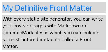
And here is a version with colored backgrounds for labels, to better understand the layout and where line heights should be considered:
Next, we will iterate to reach a pixel-perfect translation of this design into UIKit code.
Step 1: Laying out the labels
Let’s head over to a playground, create our 2 labels and position them with auto layout with the following constraints:
NSLayoutConstraint.activate([
    // X-avis: 8pt padding between card and title:
    titleLabel.leadingAnchor.constraint(equalToSystemSpacingAfter: view.safeAreaLayoutGuide.leadingAnchor, multiplier: 1.0),
    titleLabel.centerXAnchor.constraint(equalTo: view.safeAreaLayoutGuide.centerXAnchor),

    // Y-axis: 8pt padding between card and title: ⚠️
    titleLabel.topAnchor.constraint(equalToSystemSpacingBelow: view.safeAreaLayoutGuide.topAnchor, multiplier: 1.0),

    // Y-axis: 8pt padding between title and label:
    bodyLabel.firstBaselineAnchor.constraint(equalToSystemSpacingBelow: titleLabel.lastBaselineAnchor, multiplier: 1.0),
    bodyLabel.leadingAnchor.constraint(equalTo: titleLabel.leadingAnchor),
    bodyLabel.trailingAnchor.constraint(equalTo: titleLabel.trailingAnchor)
])
If you noticed this little warning in the comment ⚠️, bear with me: we will address it further down.
We haven’t written any code related to the line height just yet, but for the sake of getting an idea of where we are at this point, here is a ghost snapshot of what our view looks like if we place the Sketch design, with a low opacity, below our labels:
Step 2: Adding some paragraph style
Now, let’s address the line spacing.
The most standard approach to add line spacing is to use UILabel’s
attributedText instead of the simpler text attribute:
let attributedString = NSMutableAttributedString(string: bodyText)
// See the reason behind this substraction below
let lineSpacing = 24.0 - res.font.lineHeight
let paragraphStyle = NSMutableParagraphStyle()
paragraphStyle.lineSpacing = lineSpacing
attributedString.addAttribute(
    .paragraphStyle,
    value: paragraphStyle,
    range: NSRange(location: 0, length: attributedString.length)
)
res.attributedText = attributedString
Here we create an attributed string with a paragraph style attribute. It can control the line spacing, ie the numbers of points between two lines of text that should be added, or subtracted, to the default layout using the font metrics3.
The line spacing is the difference between the line height of the design and the line height of the font being used.
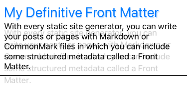
With line spacing added to both the title and the body labels, our ghost snapshot now looks like this.
A little better but not quite great yet. While the body text line spacing appears to be in line with the requirements from the design team — in the sense that it looks just a little translated upwards — the card is still far from a pixel-perfect result. What is going on?
The paragraph style’s line spacing contributes to the inner part of the line height on a given paragraph — so, effectively, on strings spanning on more than 1 line which, in our example, is the body only. However, the labels don’t apply the necessary extra outer part of the line height.
Step 3: Applying outer-padding
To meet our pixel-perfect superposition objective, we need to apply some extra Y-axis padding4 to our labels. Unfortunately, if we want to stay in the peaceful UIKit realm and not cross the border to scary Core Text territory, we need to wrap our labels with a view that will be in charge of this extra padding.
I’ll spare you the steps and repetition of code to fast forward to a convenient
UIView helper subclass that will do the job:
/// Let's keep font metrics and line height metrics together.s
struct TextStyle {
    let font: UIFont
    let lineHeight: CGFloat
}

class LineHeightedLabel: UIView {
    init(text: String?, textStyle: TextStyle) {
        self.wrappedLabel = UILabel()
        self.textStyle = textStyle
        super.init(frame: .zero)
        translatesAutoresizingMaskIntoConstraints = false
        setupViewAndConstraints()
        setText(text: text)
    }

    @available(*, unavailable)
    required init?(coder _: NSCoder) {
        fatalError("init(coder:) has not been implemented")
    }

    // MARK: - Inspecting the view

    let wrappedLabel: UILabel
    let textStyle: TextStyle

    var text: String? {
        get {
            return wrappedLabel.text
        }

        set {
            setText(text: newValue)
        }
    }

    private var topYAxisConstraint: NSLayoutConstraint?

    private func setupViewAndConstraints() {
        wrappedLabel.translatesAutoresizingMaskIntoConstraints = false
        wrappedLabel.font = textStyle.font
        addSubview(wrappedLabel)

        // We apply the line height contribution to this constraint.
        // Since its constant might evolve over time, let's keep a reference.
        let safeTopYAxisConstraint = topAnchor.constraint(equalTo: wrappedLabel.topAnchor)
        topYAxisConstraint = safeTopYAxisConstraint

        NSLayoutConstraint.activate([
            safeTopYAxisConstraint,
            leadingAnchor.constraint(equalTo: wrappedLabel.leadingAnchor),
            trailingAnchor.constraint(equalTo: wrappedLabel.trailingAnchor),
            centerYAnchor.constraint(equalTo: wrappedLabel.centerYAnchor)
        ])
    }

    func setText(text: String?) {
        guard let text = text else {
            // No text? Then no padding either.
            topYAxisConstraint?.constant = 0.0
            wrappedLabel.text = nil
            return
        }

        // This is the extra padding we want.
        // Half of it will go on top of the label.
        // The other half will go at the bottom of the label.
        let lineSpacing = textStyle.lineHeight - textStyle.font.lineHeight

        let paragraphStyle = NSMutableParagraphStyle()
        paragraphStyle.lineSpacing = lineSpacing
        paragraphStyle.alignment = wrappedLabel.textAlignment

        // Build an attributed string
        let attributedString = NSMutableAttributedString(string: text)
        attributedString.addAttribute(
            .paragraphStyle,
            value: paragraphStyle,
            range: NSRange(location: 0, length: attributedString.length)
        )

        topYAxisConstraint?.constant = -(lineSpacing / 2.0)
        wrappedLabel.attributedText = attributedString
    }
}
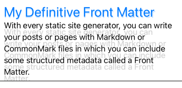
Where are we now? Let’s look at our ghost snapshot:
Even though the mysteries of text-layout algorithms led Sketch and Xcode to make different decisions about when to break lines, it seems like our code does a good job respecting the designed layout so, tada 🎉, we’re done! All that’s left to do is to copy paste this little helper everywhere.
Well… sure, but be careful. While this wrapper does a good job in the context of this exercise and its API5 is considerably stable, I actually wouldn’t take this approach. Let’s see why.
A sturdier alternative using font descriptors and text constraints
The major drawbacks about this little helper are:
- While it’s not super fragile, it is still not a great API since it only handles two attributes (line spacing and text alignment);
- It adds an extra wrapping view for every label in our design. While this might not be really expensive to lay out, it is not very intellectually satisfying;
- It requires to bend Apple’s own rules to do your thing. If more than 12 years of iOS development has taught me one thing, it is that following Apple’s guidelines will end up being a great return on investment either whenever Apple launches its next big thing or when you discover your app had a blind spot (accessibility being the usual suspect).
So what rule are we bending? Remember the little ⚠️ from above? Well if you replace this constraint:
// The origin of the titleLabel frame will be 8pt below the view's.
titleLabel.topAnchor.constraint(
  equalToSystemSpacingBelow: view.safeAreaLayoutGuide.topAnchor,
  multiplier: 1.0
)
by this one — which is likely what Apple wants you to do when you are handling labels constraints:
// The origin of the titleLabel frame will be 11pt below the view's.
titleLabel.firstBaselineAnchor.constraint(
  equalToSystemSpacingBelow: view.safeAreaLayoutGuide.topAnchor,
  multiplier: 1.0
)
You end up with a slightly different result: the title label will be laid out
3pt further down if you use the text-specific constraint. Since the system knows
that titleLabel is a title1 it will add additional padding that will look
quite better, without any design cost.
Apple is very thoughtful about system font sizes and line heights, as
demonstrated in the Typography section of their Human Interfaces
Guidelines. If the designer in your team still wants to make adjustments on
point sizes and line spacings, a sturdier alternative to using lineSpacing
might be to leverage font descriptors to slightly alter the font metrics so that
they better match your designs. You could use either traitLooseLeading or
traitTightLeading to slightly modify the line spacing of fonts.
For our specific line height situation, we want traitLooseLeading:
let font: UIFont = .init(
    descriptor: UIFontDescriptor
        .preferredFontDescriptor(withTextStyle: .body)
        .withSymbolicTraits(.traitLooseLeading)!,
    size: 0
)
Here is another ghost snapshot that doesn’t require to wrap UILabel or use
attributed strings. Instead, it uses just the adequate constraints, a font with
a looser leading, and a simple tweak to use a multiplier of 1.4 for the space
constraint between the title and the body.
While this solution will give you less control to get a perfect ghost snapshot (see how the card’s total height is not as high as the Sketch design?), I think it is the best option for most cases, that should be negotiated with your design team.
Check out ⛹️ the playground to run the code in Xcode.
Related Links
-
Credits for this awesome adjective go to Josh W. Comeau ↩
-
I know it looks like 💩 that is not the point 😉. ↩
-
Every font has a lot of metrics. Apple’s Using Text Kit to Draw and Manage Text document is very helpful to learn about them, especially the Font Metrics figure that is a good recap of the most important ones. ↩
-
Since we’re exploring multi-platform design — that, let’s face it, is heavily influenced by the web lingo —, we might as well just start using it here. ↩
-
Updating the text, for instance, will not break the layout, even if you set the text directly on the wrapped label. ↩